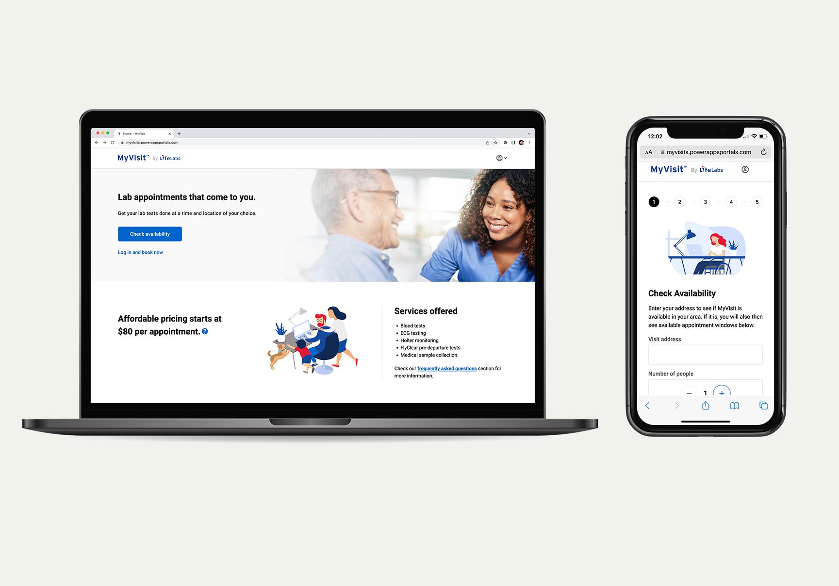
LifeLabs needed a new lift for their mobile service portal called MyVisit, a service that provides mobile lab testing to their patients at their home via online appointments. Technicians can perform blood collections right at their homes. The initial launch was a quick MVP a few years ago that needed a complete redesign to increase its conversions.
For most of my time at LifeLabs, I helped steer the new user experience in the right direction with UX design expertise and research. I also relied on survey insights and analytics to help influence the improved UX/UI decisions. Within almost a year, the new and improved experience is now live and running for the public to use. We also ensured it was accessible from a design point of view. The new experience resulted a 10% increase in ease of use and customer satisfaction.
We had a couple of vendors that worked with the LifeLabs team on this initiative where I was providing feedback on their UX design work, wireframes and mock-ups. We worked closely with the vendors, including the designers to ensure the quality of work and requirements were met. I was working with them on design iterations inbetween UserTesting which began at the wireframe stage and preparing the prototypes for testing.
The evaluative research was done mostly via UserTesting for flexibility and time efficiency as the project had a tight deadline with limited time of resources.
Overall, after several rounds of moderated and unmoderated UserTesting, key findings and recommendations were shared to aid in the decision-making for UX design improvements as well as some business related changes, however, there were some decisions that were put in the backlog due to short on time and resources before the launch date. Some key UX/UI decisions that were considered:
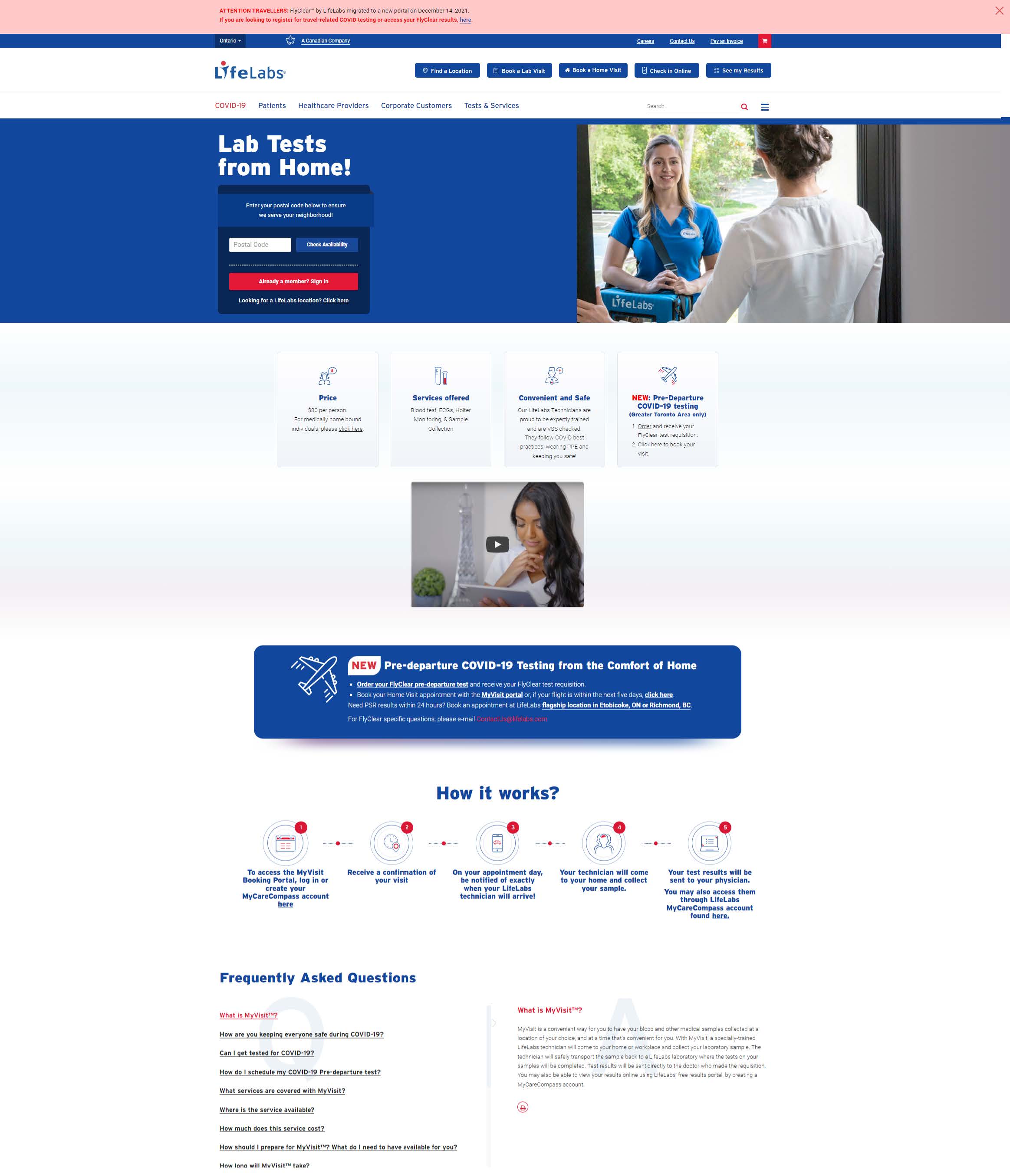
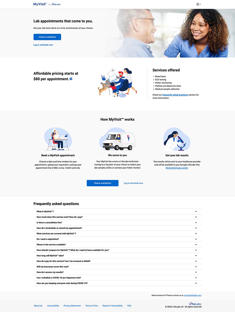
The marketing landing page was redesigned and I conducted usability testing more than once on iterations mainly on messaging on cost and about MyVisit, as well as layout. The new landing page has a more engaging look and feel and improved hierarchy for content and call to actions.
The booking flow received a major lift in design and functionality. This part of the experience was also tested with users more than once with iterations.
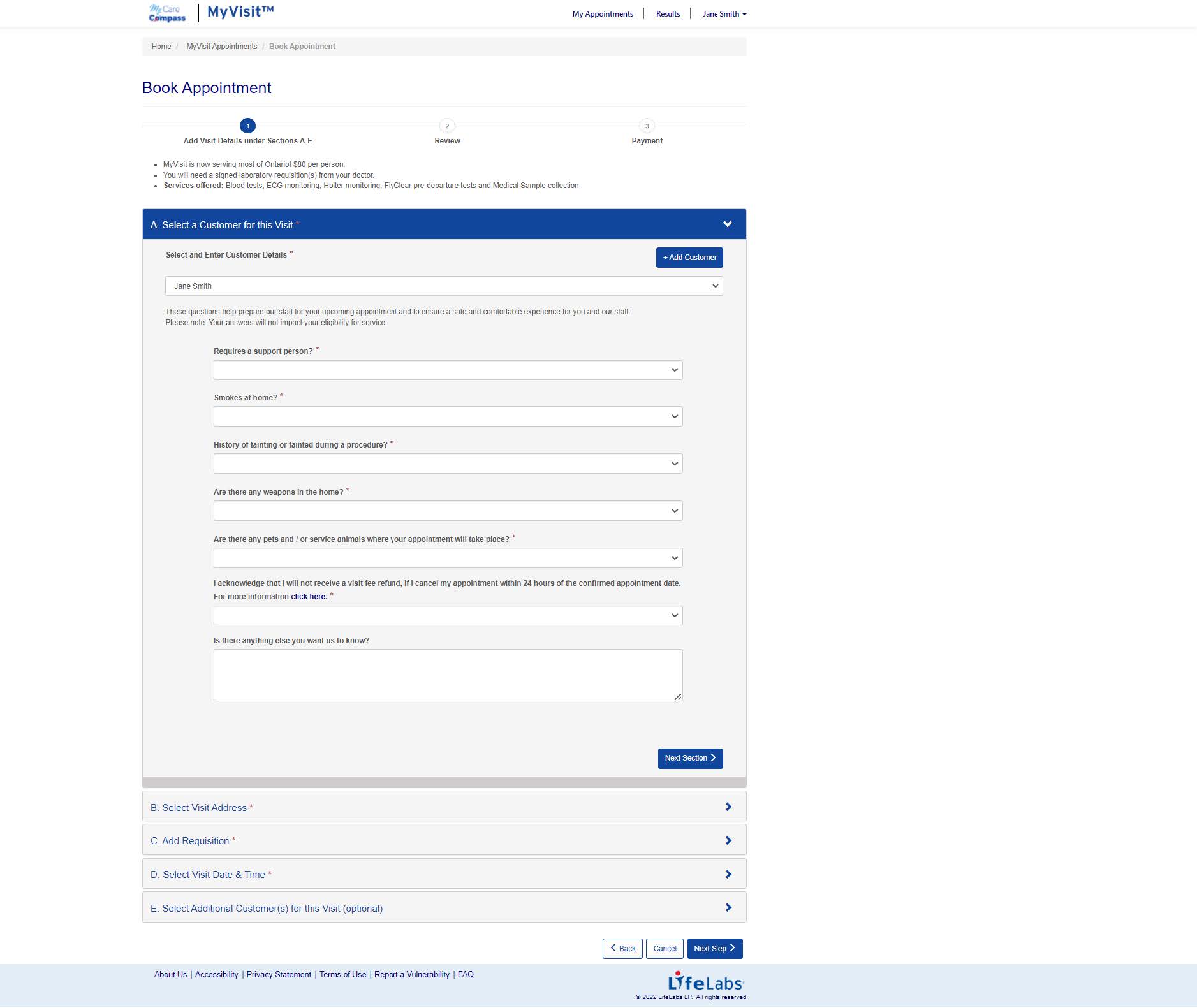
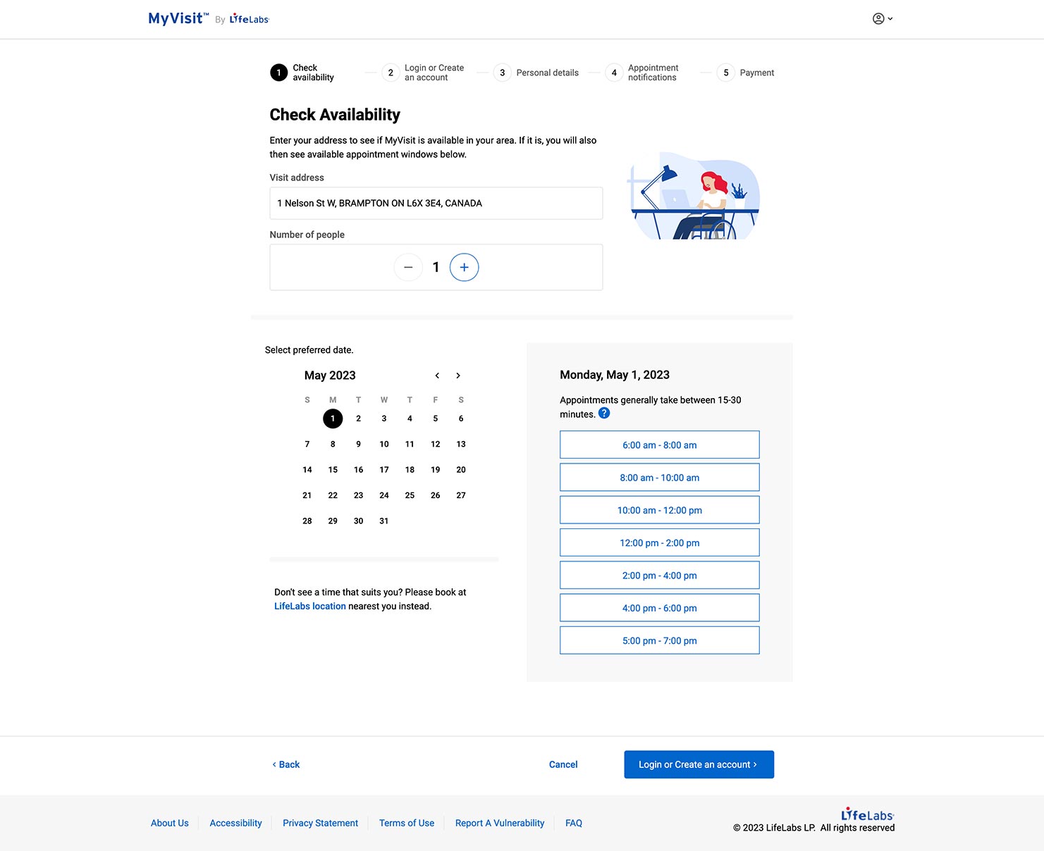
Overall, the re-design of the new MyVisit portal was deployed in a phased approach, and I worked closely with the product managers and designers in ensuring we're moving in the right direction.
After the launch, for measuring and reviewing performance, the team used analytics, customer feedback from the customer care support team, and surveys.
Have a questions or want to chat about possibly working together?
Feel free to contact me!