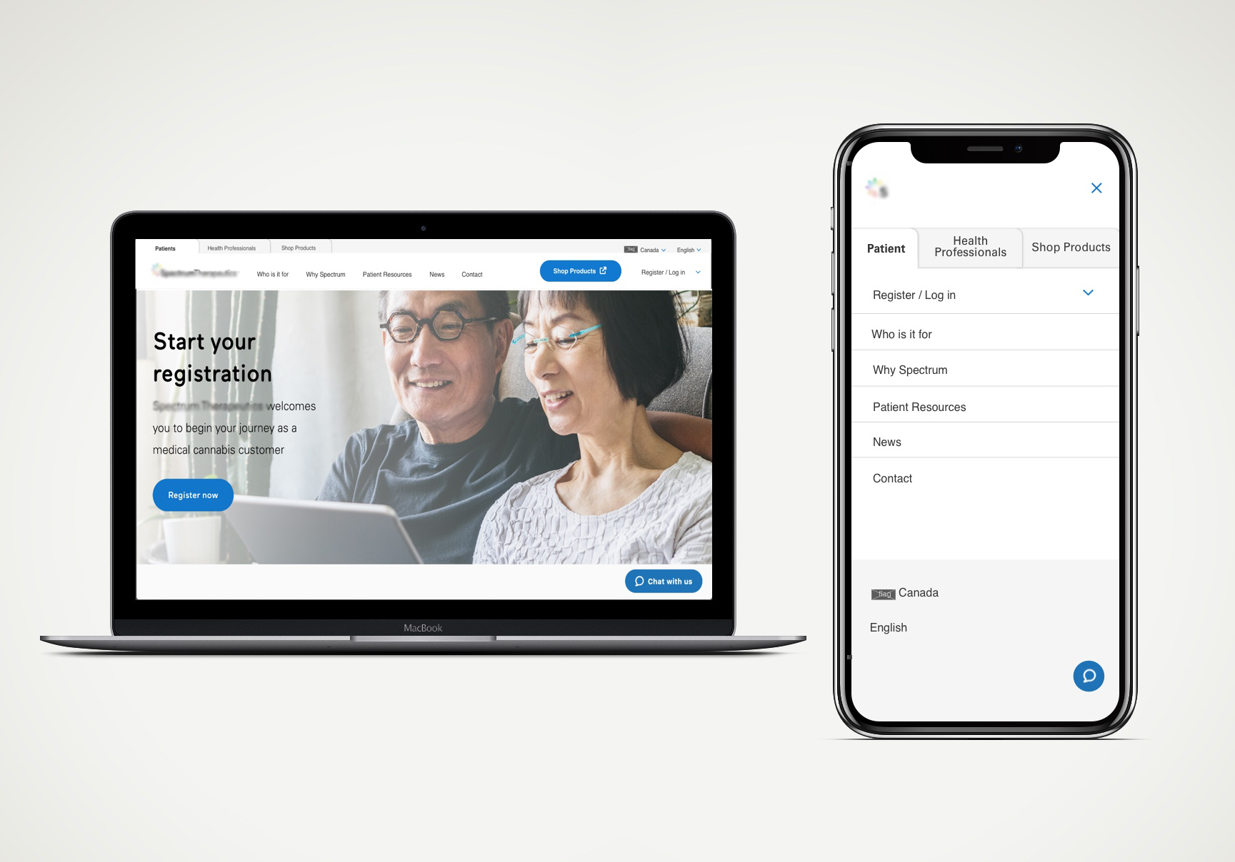

As a UX design lead for optimizing the medical cannabis brand's website while working at Canopy Growth, the navigation and content were the main problems that needed to be solved to create a seamless experience for health professionals and patients. The biggest problem was the navigation was first built using three different web services (AEM, Shopify and a portal) which resulted in a general broken experience for both health professionals and patients, as well as for logged-in users.
The initial idea was to merge all three web services into one, where I had a more seamless solution with Shop being integrated but this decision, later on, had to change due to budget and priority adjustments. I ended up changing the initial solution slightly to meet the new technical requirements and split into a three-tabbed approach, whereas the initial approach was to only keep Health Professionals and Patients separated with Shop merged in Patients with a more consistent logged-in experience. Along with the navigation redesign, I also proactively made recommendations on improving content.
I needed to understand both health professionals and patients in the medical cannabis space. I asked for some preliminary research that was conducted a while back, and I took the initiative to plan and test both user groups to explore the website and current navigation for general observation to validate some existing UX issues and develop concrete hypotheses. I wanted to observe how different they are in navigating through the site while being asked particular task questions. We also identified through insights from Customer Care that there was a problem for existing customers noticing the confusing changes between AEM and Shopify navigation that seem to be the same but don't have consistent login status.
The evaluative research was done via UserTesting for flexibility and time efficiency as the project had a tight deadline along with other tasks I managed.
For the first round of testing, it was more for general observation as a start and to develop more concrete hypotheses. Here are the following key insights from testing with 14 participants (6 health professionals + 8 patients):
The product manager organized and led a workshop with key stakeholders to get a better understanding of the key health professional personas using preliminary research, what they know about health professionals in the medical cannabis space, as well as using the findings from the UserTesting to instigate discussions for the website. The workshop had provided interesting views on the medical cannabis space overall, beyond the digital experiences as well.
After I compiled the discussion points from the workshop into experience maps, we finalized the proposed navigation (in a split between Patients and Health Professionals) and planned a phased approach to improving the content for health professionals.
As for the Patients' side of the user journeys, I took some of the insights from the first and second rounds of testing in parallel with the content strategy. I used the second round of testing on the new navigation in phase one to further improve it from the patients' perspective. I combined the qualitative research with Adobe Analytics to further refine the IA and content strategy. The analytics helped guide the IA and content strategy on where users are commonly looking at using Adobe's heatmaps and what links they are clicking the most on certain pages.
As part of the process of re-designing the navigation, I created sitemaps and user flows to demonstrate the new structure more easily at a glance for stakeholders and developers to understand. This also helped the creation of a content strategy along the way.
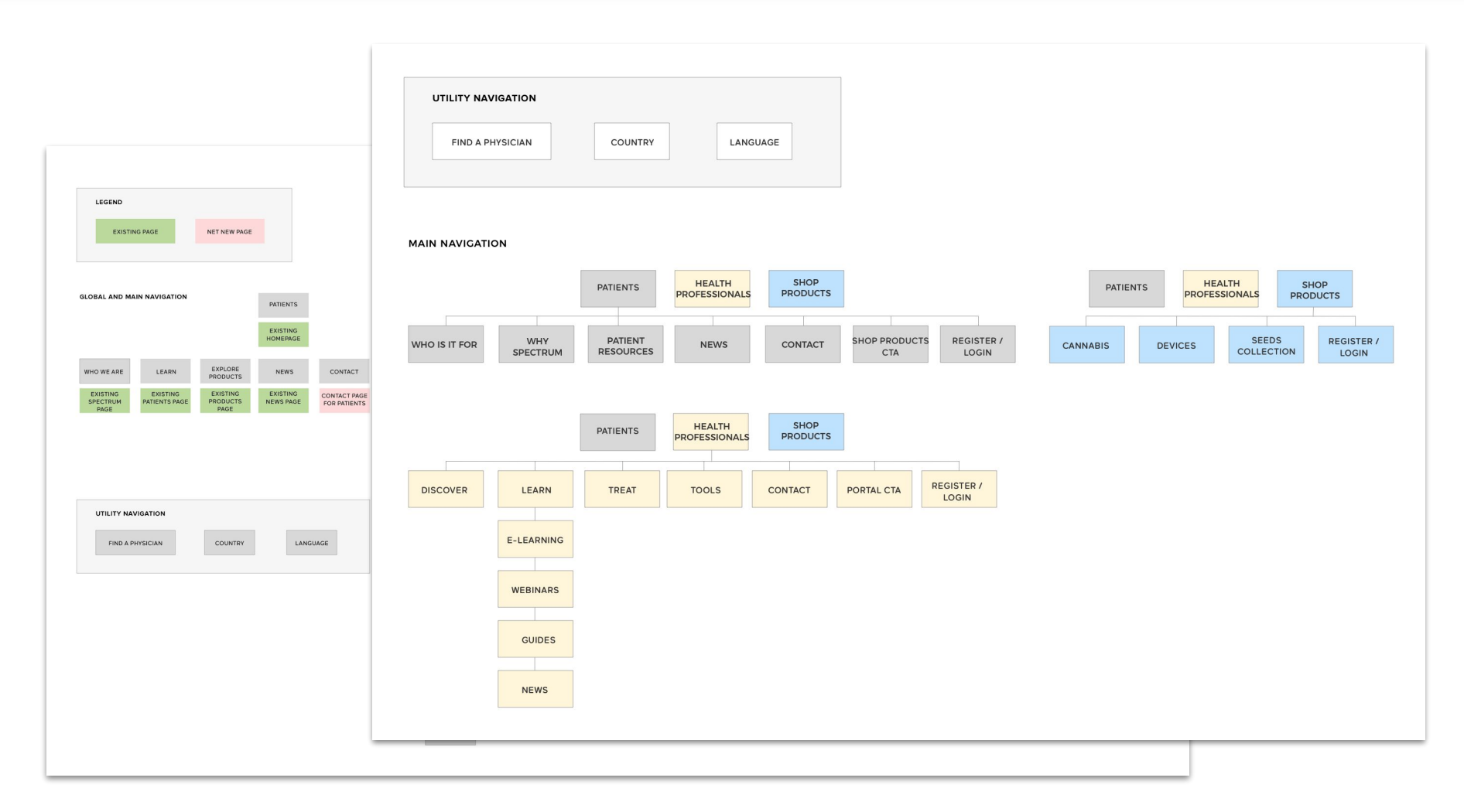
Overall, for the navigation re-design, I lead it from discovery and planning to the interaction design, while collaboratively working with stakeholders. I was working closely with the front-end developers to ensure the vision was met which later was slightly adjust after another round of testing on the live website. I also made sure that the Adobe Experience Manager (AEM) and Shop navigations were about 100% the same as they were developed by different developers. I used JIRA to communicate with developers on updates.
The navigation went through some iterations before and after the second round of testing (more so on Patients side), along within a phased approach due to lack of immediate content. The end result of the new final navigation would not only support a more seamless experience for each user group but also support a clear journey to more educational content once new content would be developed.
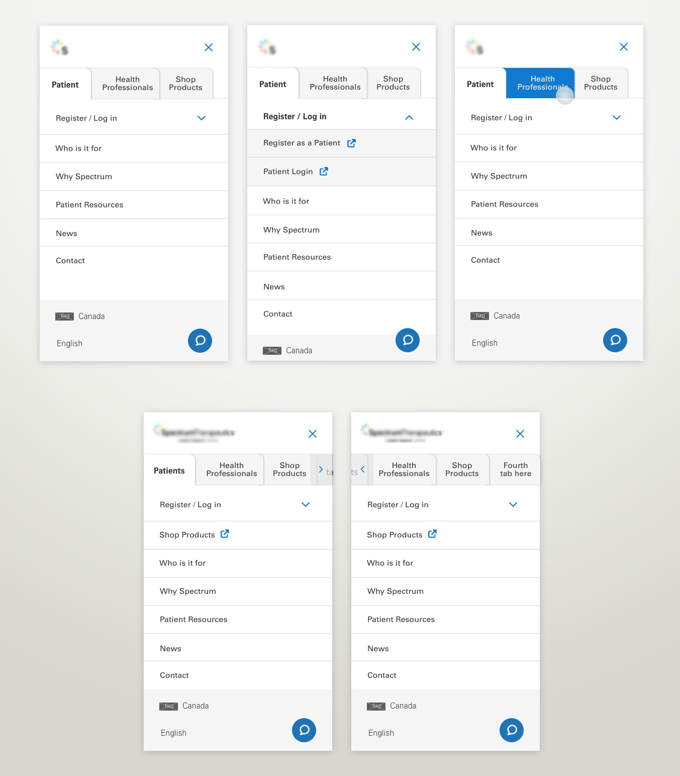
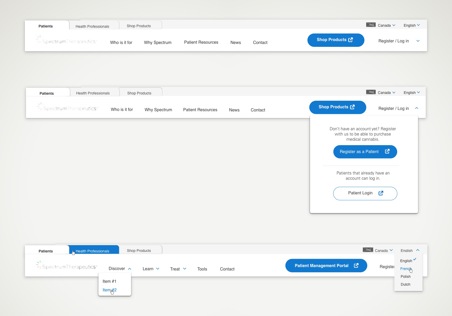
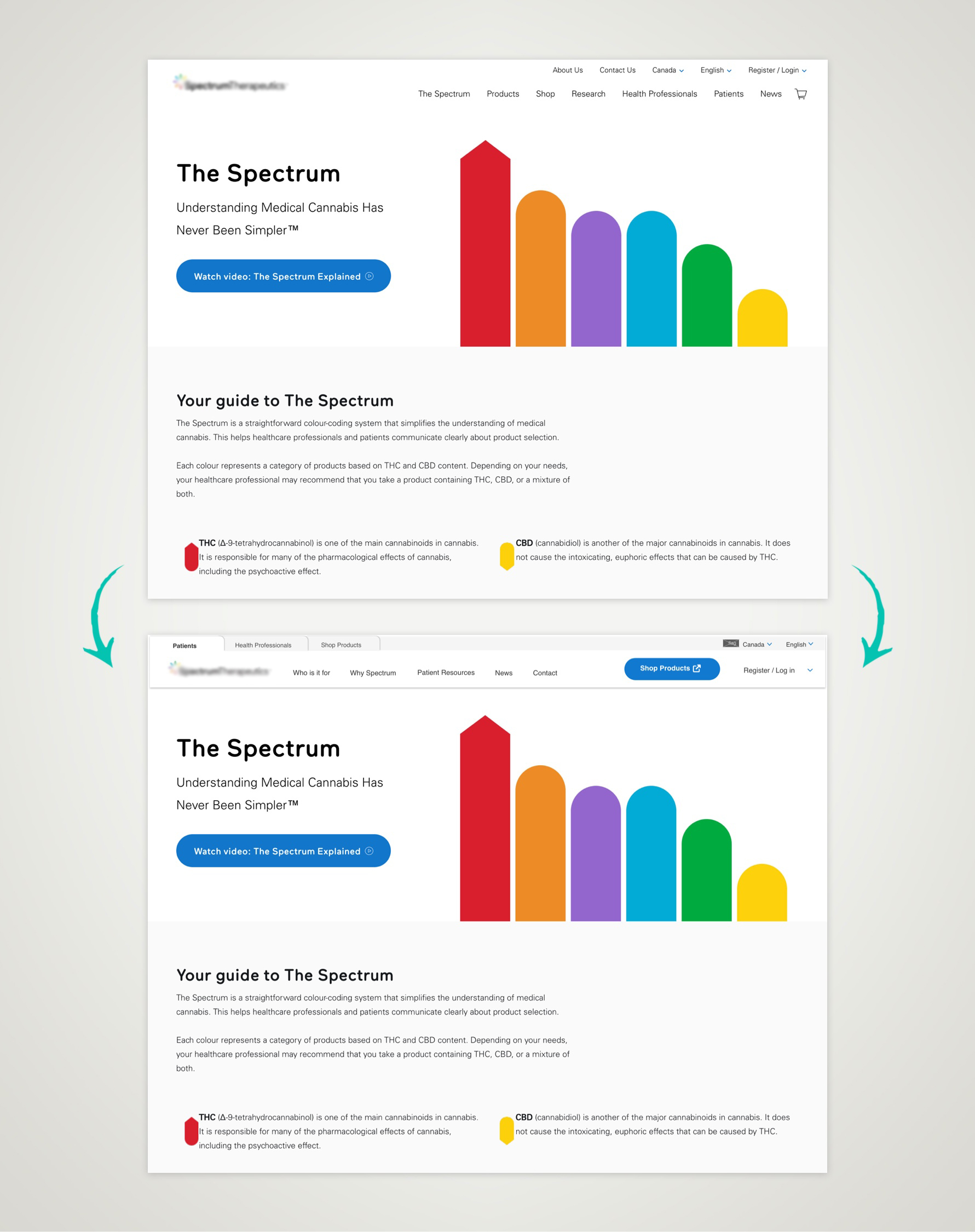
While providing more educational content in parallel to further refining the new navigation, developing a content strategy was the second part of the website re-design process. I was primarily leading this initiative with the content specialist on the team. I used the stakeholder workshop materials, preliminary research and the first round of testing to start with.
The second round of usability testing validated key hypotheses and revealed opportunities for content and future optimizations. This round mainly focused around how potential customers aren't fully understanding Spectrum's products and medical cannabis with the current content. The new navigation of phase one was deployed at this time which resulted a slight improvement for the patients' experience despite content not being updated yet. I also evaluated key pages based on relevant usability heuristics that were going to be tested on for further validation and evidence.
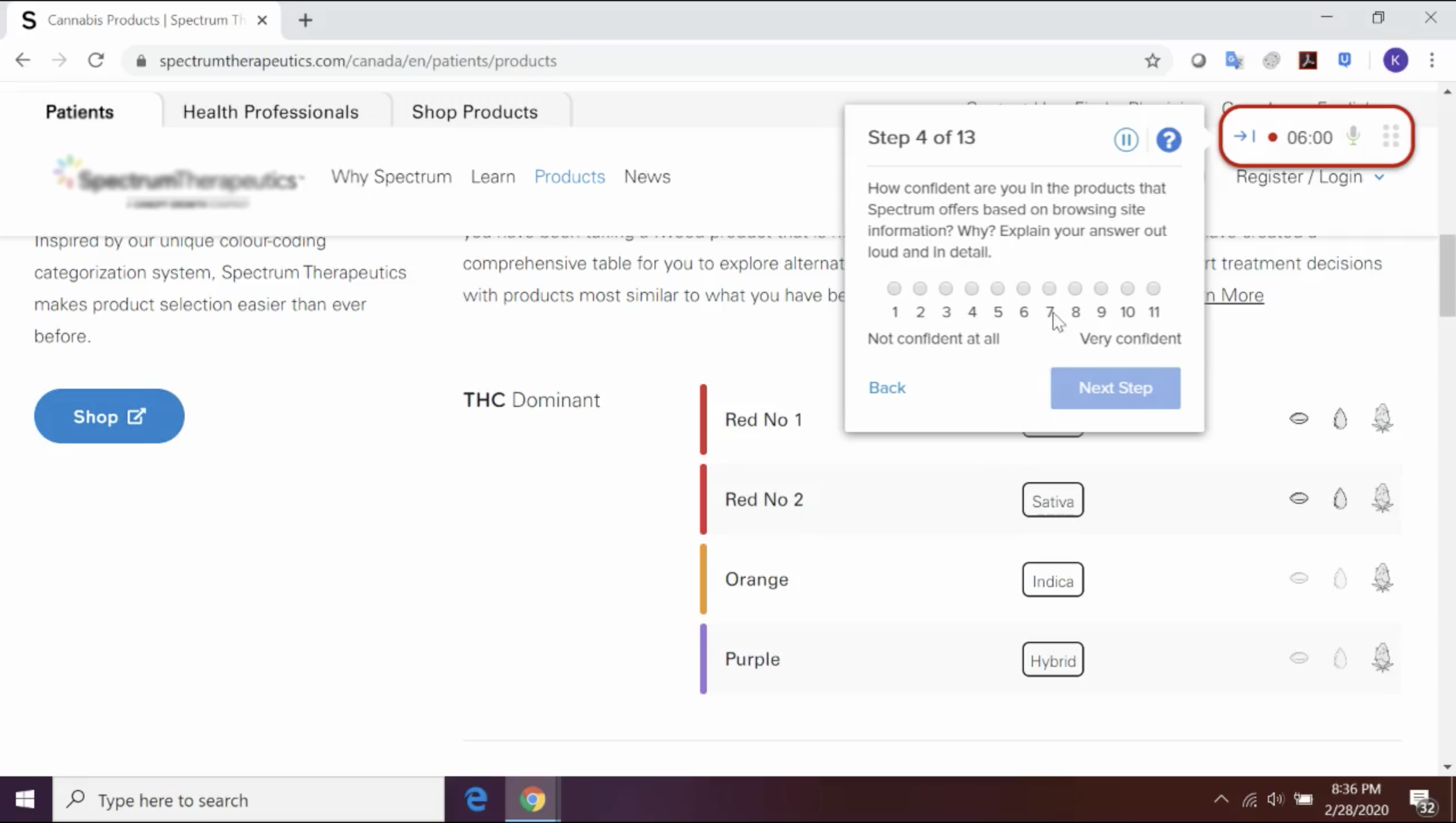
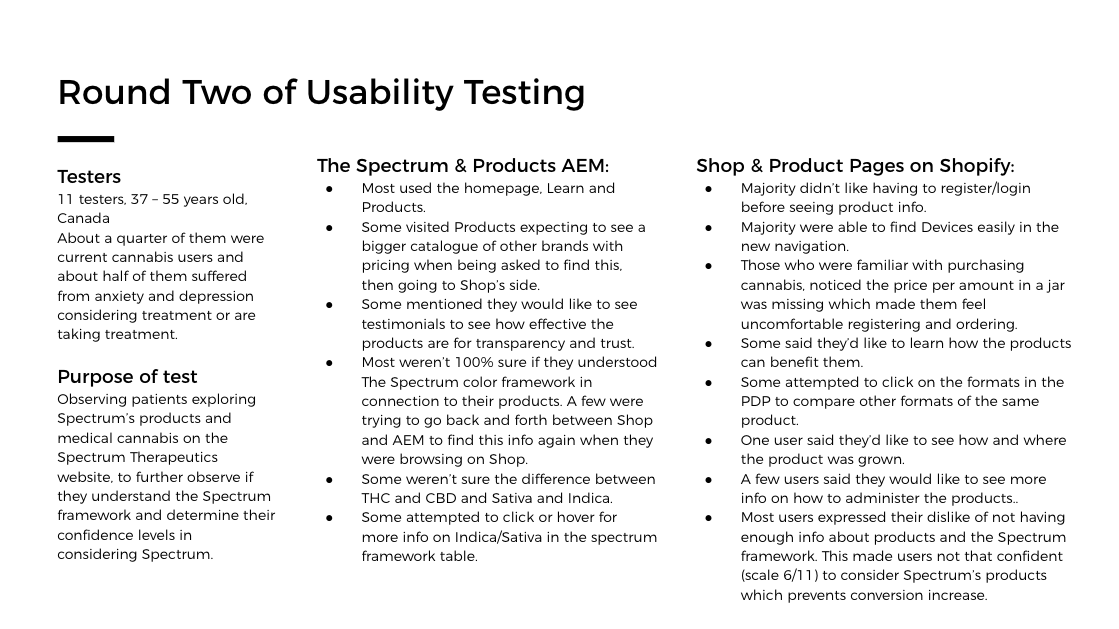
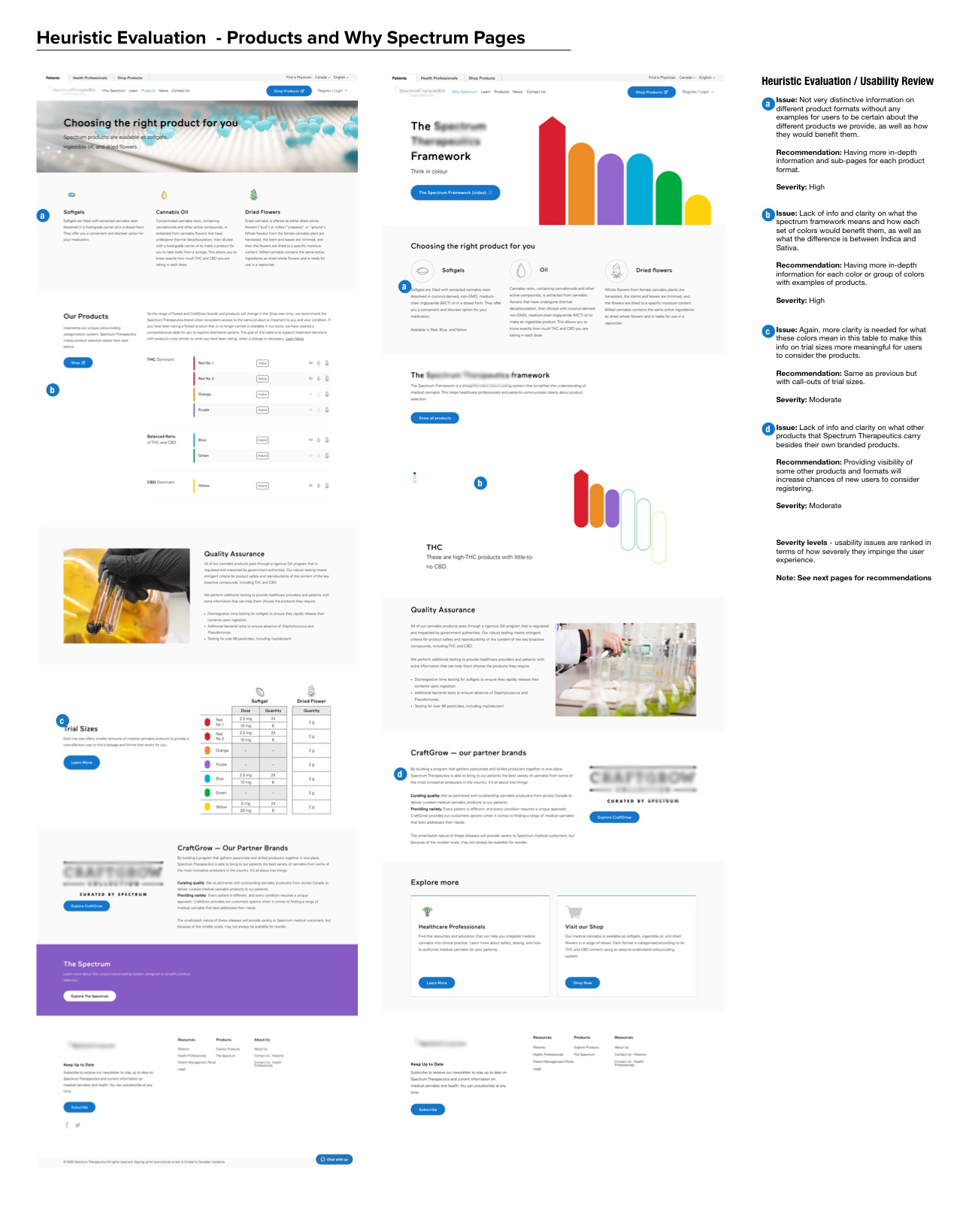
Based on these insights and usability heuristics, along with how improving key product pages can mitigate risks and increases conversions, the team agreed on which key webpages and content to improve on in a phased approach due to timing and resources. I proposed a small UX and business strategy to the team for them to understand why making these improvements would be important for the customers and the medical brand.
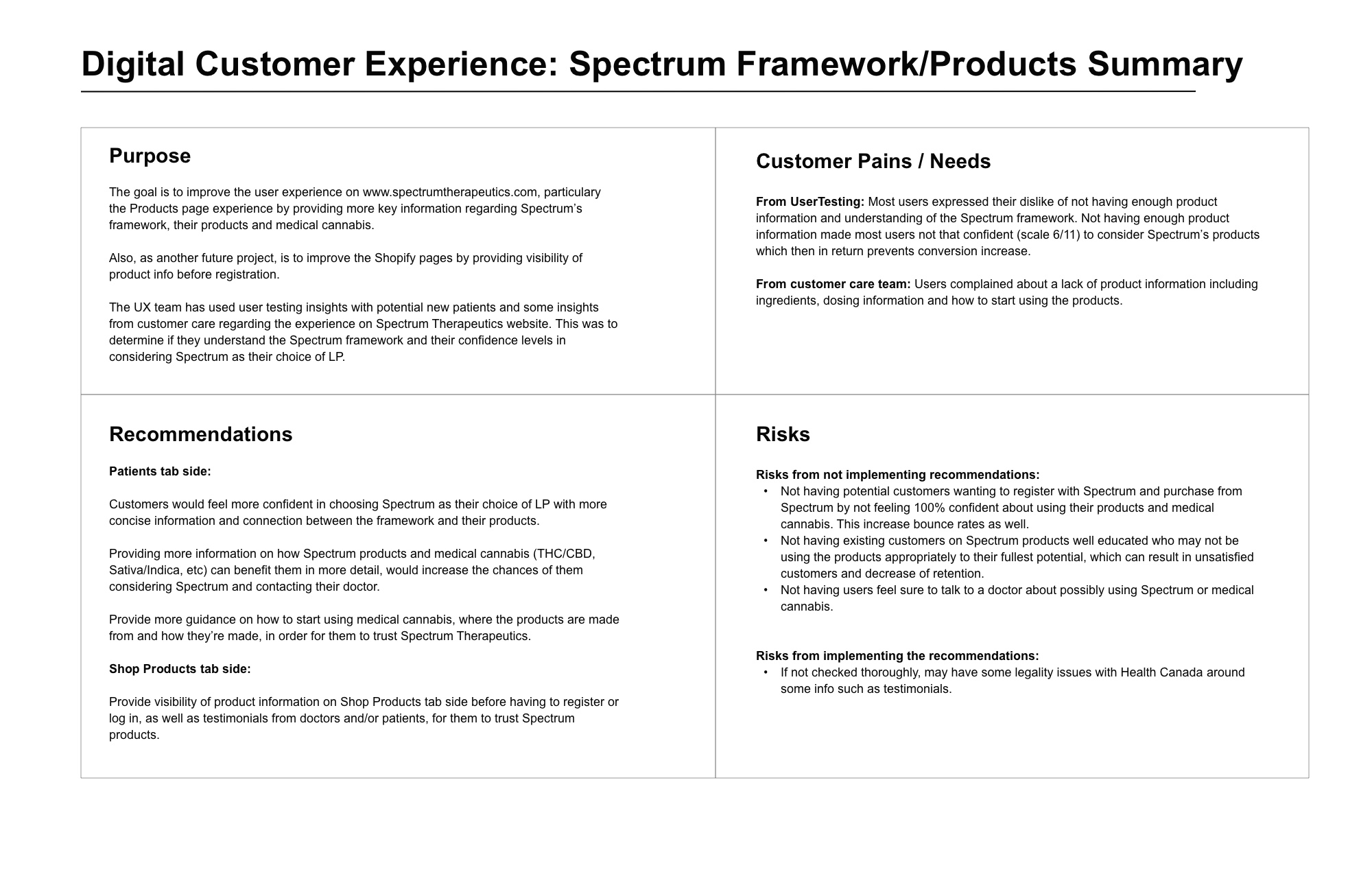
I worked on iterations of high fidelity wireframes which were circulated amongst stakeholders and the content specialist for feedback and agreements. Once they were finalized, the content specialist and I briefed in the creatives for new content in a phased approach.
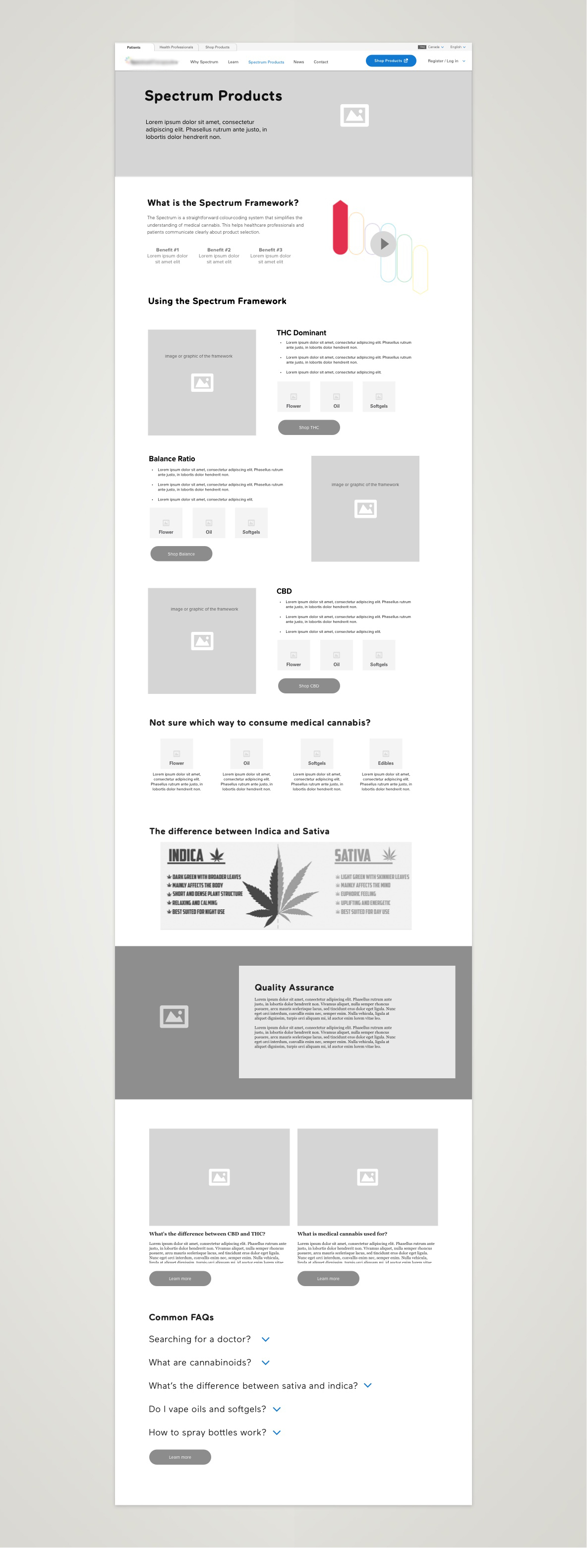
Overall, the re-design of the website was planned in a phased approach, and I worked closely with the product manager in ensuring we're getting the resources and support we need. The new navigation has been developed for the first phase and the content development was in the process for its first phase. Some changes have been made since deployment in 2020.
Have a questions or want to chat about possibly working together?
Feel free to contact me!