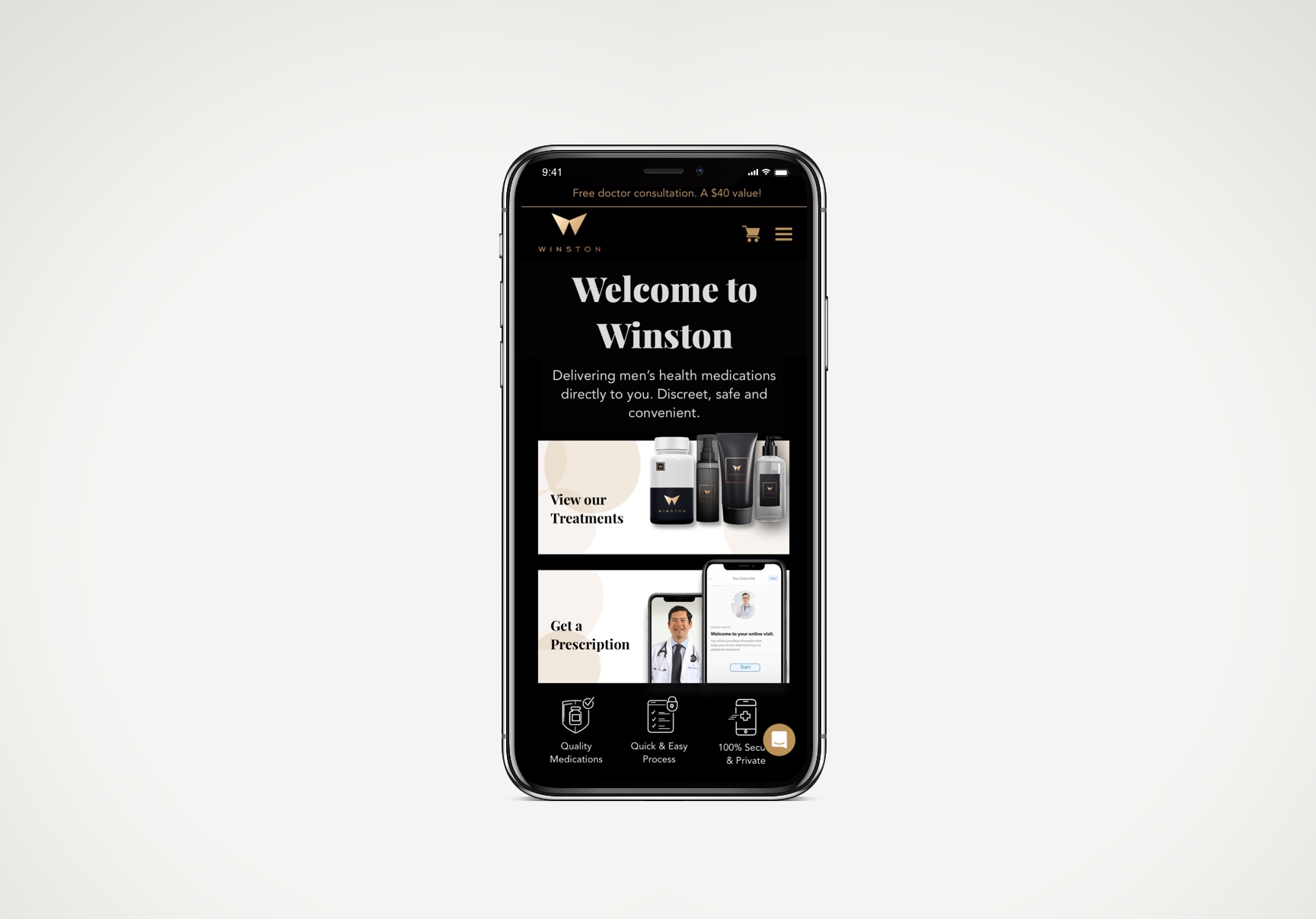

A start-up called askwinston.ca, an e-commerce and telemedicine company for men's health, requested optimizations on their website to improve conversions and user flows.
I worked closely with the CEO and the team by gathering requirements and quantitative data and used it to help build a redesign involving the customer shopping experience as the first objective. I also additionally provided a UX and competitive analysis for them to understand what needs to be done.
Upon initial request, I probed them with more questions around current conversion rates, pages with the highest bounce rates, registration vs. purchase rates, key hotspots of where users are clicking on the most on the homepage in which they provided heatmaps, and asking why the need of some new features, and etc.
They were also planning to add more features and content to the brand's vision with the goal to provide more than just men's health products, but also online services such as mental health support, fitness training and nutrition. They needed guidance on how to implement these.
As the only UX designer for this optimization project, I initiated a strategy that I presented to the client to confirm the recommendations before working on the deliverables. I utilized the quantitative data and heatmaps they shared. They agreed with most of the ideas I recommended and appreciated the extensive analysis I conducted on their website and on key competitors to identify their advantages and disadvantages in comparison.I was focusing on mobile design first because I identified that majority of their users are mobile users.
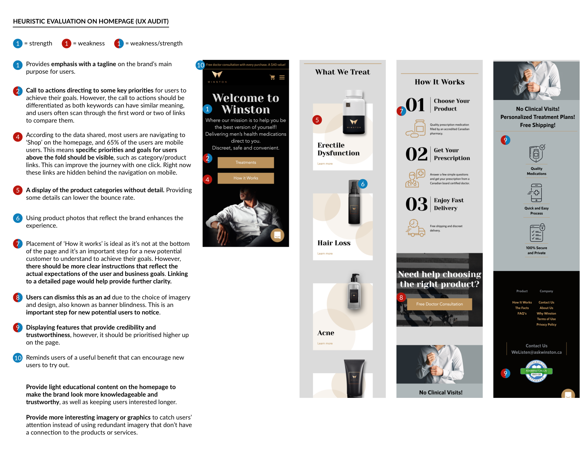
What is hugely impacted that I suggested improving upon is the lack of content on the homepage and product pages, which both had the highest bounce rates of up to 60%. I also identified issues from a user flow perspective that made the experience frustrating for the potential customer that also correlates to the major imbalance between registration and purchase rates. There was a lack of understanding of the first and most important step in receiving a prescribed product online, which is to speak virtually with a medical expert to get a prescription for the desired product.
I also recommended slightly adjusting the brand's look and feel that appropriately demonstrates the brand's mission with more real-life imagery that have a meaningful connection to the products and services, rather than repeating the same type of imagery throughout.
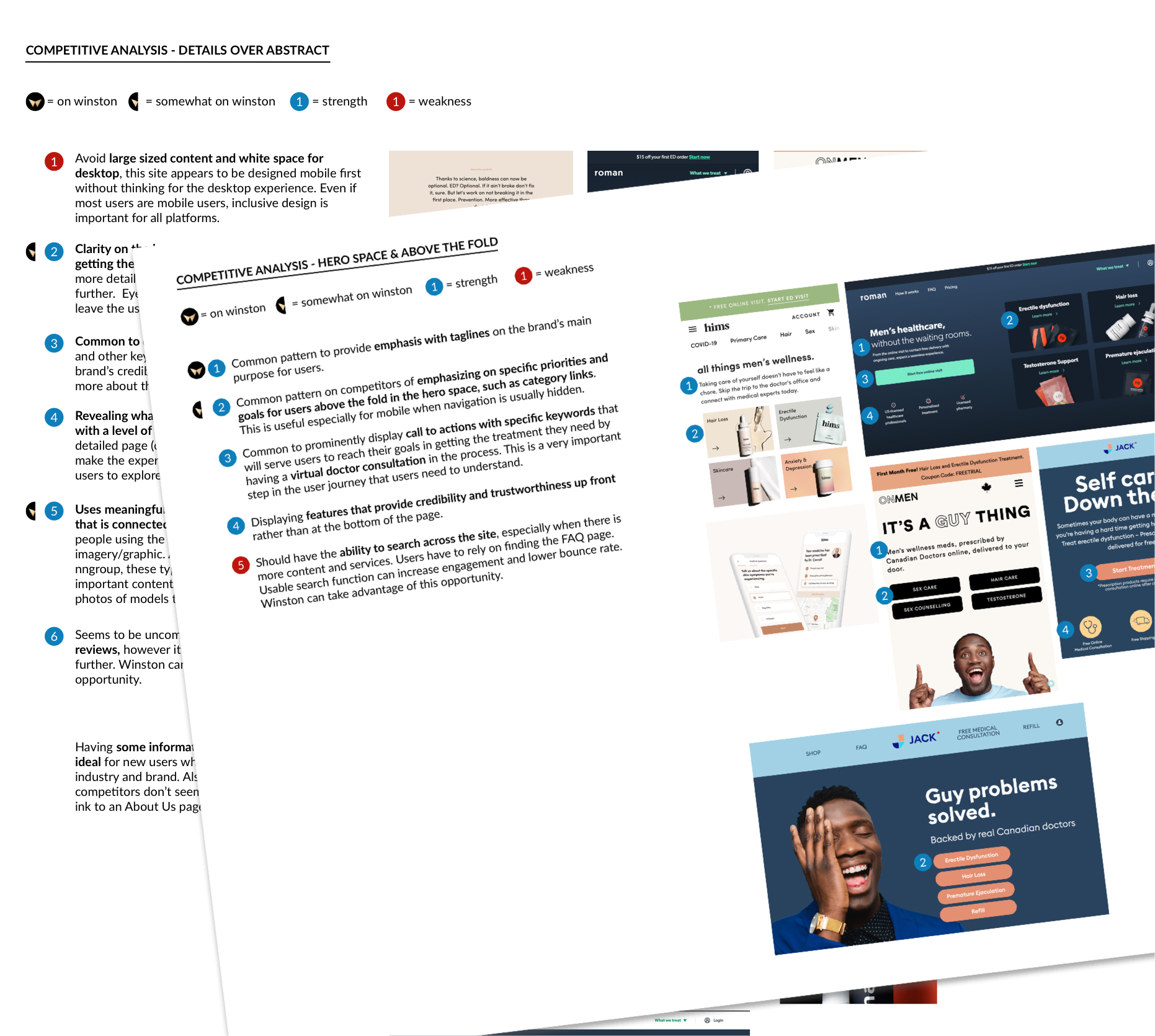
I noticed a common design pattern amongst competitors of highlighting key services above the fold for quick access especially on mobile when the navigation is hidden, as well as providing concise information on the steps required for potential customers to receive their prescribed products. Some also had smoother registration flows.
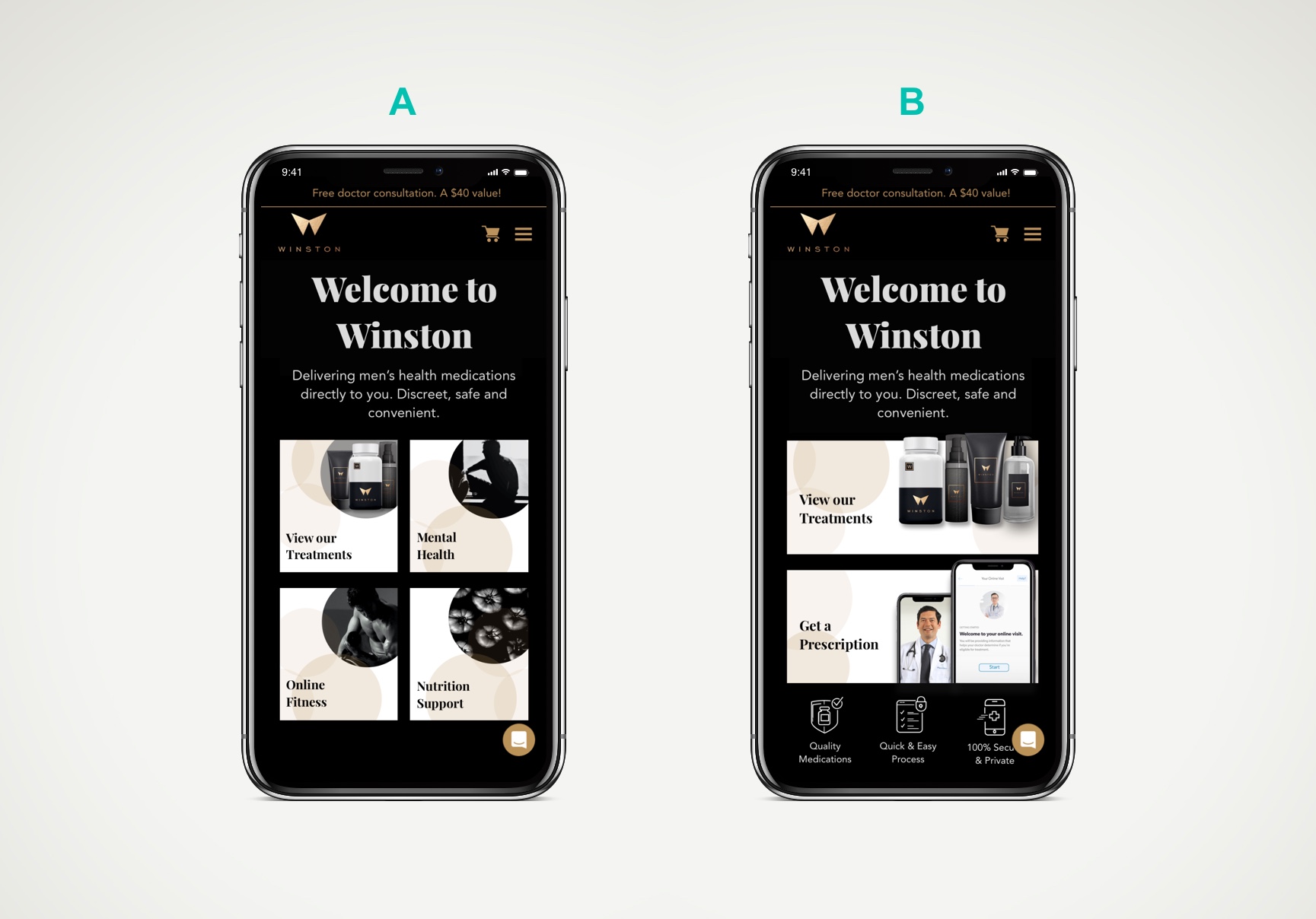
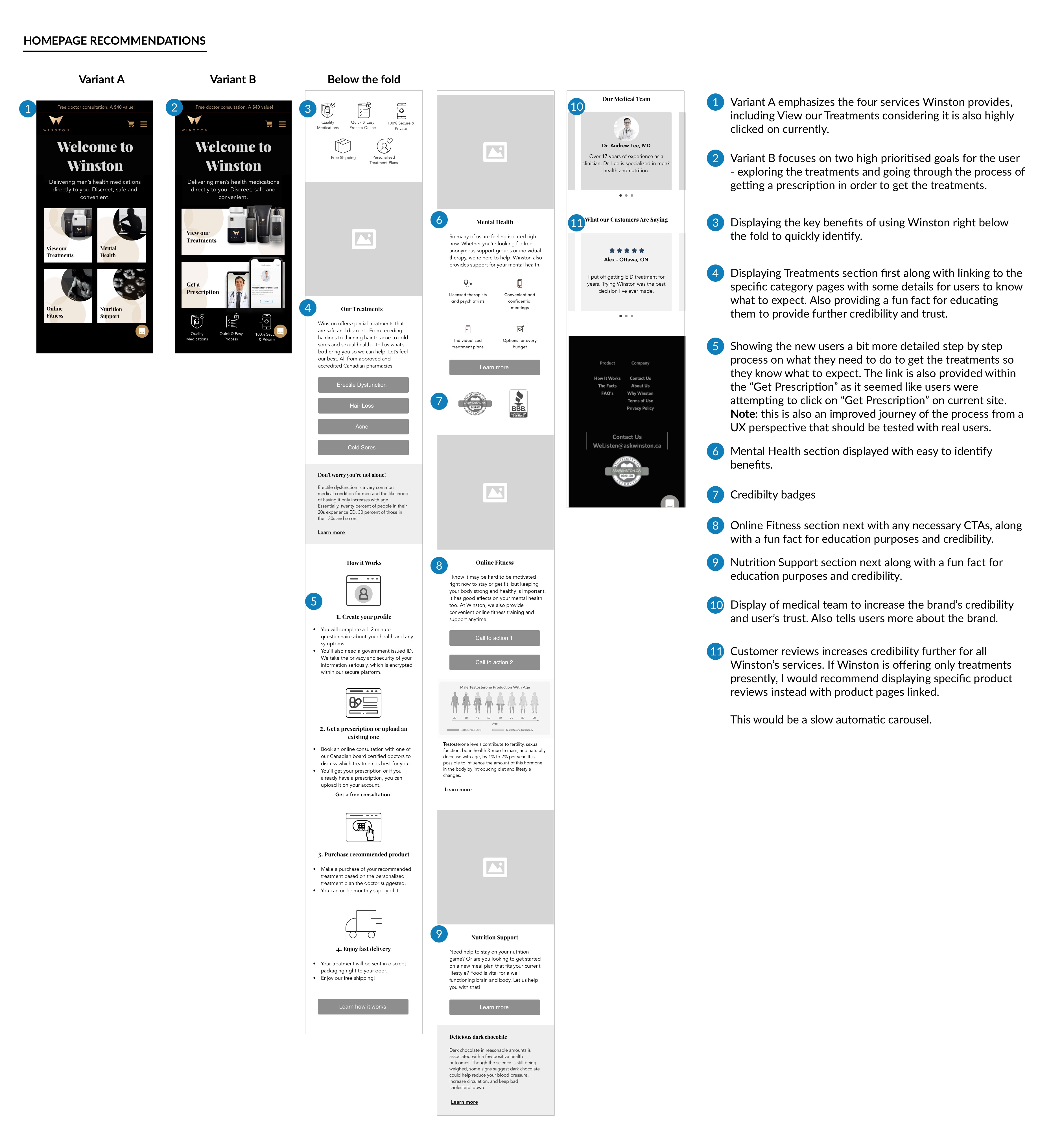
As attaining new customers were one of the business goals for conversion, I also recommended implementing A/B testing for the homepage as a starting point to identify if potential new customers are navigating to key user tasks quicker in one layout over the other, what actions are they most interested in on clicking, and identify if the bounce rate will decrease by providing more visible options for users to explore. This in return can increase conversion as well. I also wanted to differentiate the actions further rather than simply use "Treatments" and "How it works" call to actions. Another feature to test in variant B is to visibly display key benefits of using the brand's products above the fold to increase awareness for new potential customers.
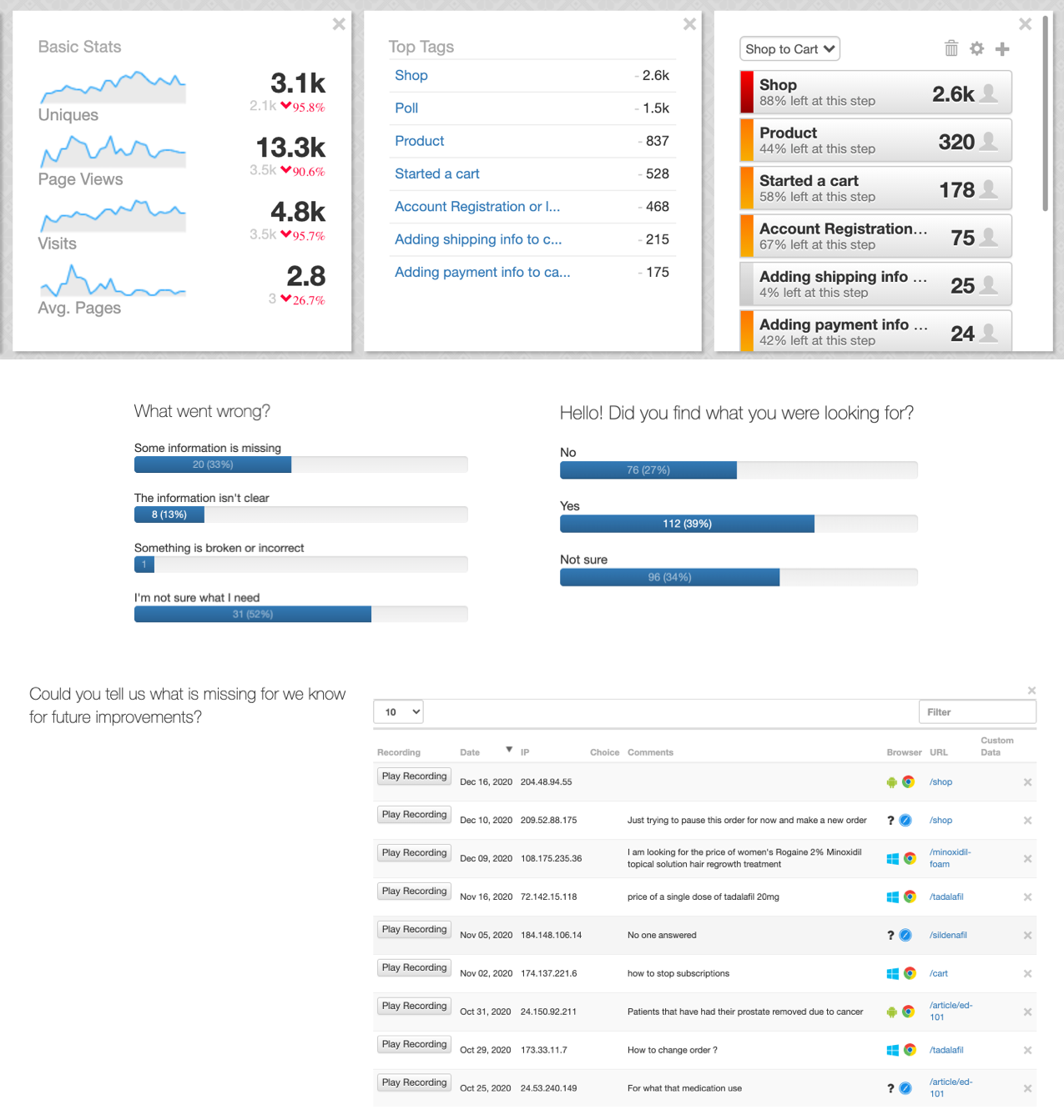
We ended up pivoting our focus to the product pages after I was able to gather more data using LuckyOrange (similar to HotJar) and hearing more customer complaints. As mentioned before, it was already evident that the content on these pages needed improvement due to very high bounce rates. Lack of transparency and clear content potentially impacts customer conversion and engagement. The second major issue is the checkout experience and not being able to cancel their orders seamlessly.
I proposed a thorough and reasonable plan to my client on the major issues that needed to redesign in sections rather than as a whole due to needing to adapt to their development cycles.
I conducted a further competitive and heuristic analysis on the product pages to help provide a benchmark of requirements. I also used quantitative data from a live intercept survey I created on LuckyOrange to gather real-time data from prospective customers navigating the website. The survey helped us validate the root problem and bounce rates further which resides in the fact that they do need help finding out what they need and key information is missing which can result in users having doubts about the brand and their products. The survey even shed light on other issues as well.
I also analyzed the whole customer journey from landing on the homepage or another landing page from an ad to new user registration as well as for existing customers that placed subscription orders. I detected user experience issues holistically and recommended more touchpoints via email and pop-up confirmations. I provided effective UX writing for micro-interactions and email.
Due to the lack of budget for usability testing during the stages of defining and ideating, I tried to take advantage of the data and tools I was able to use. I also worked closely with the SEO specialist on data from Google Analytics.
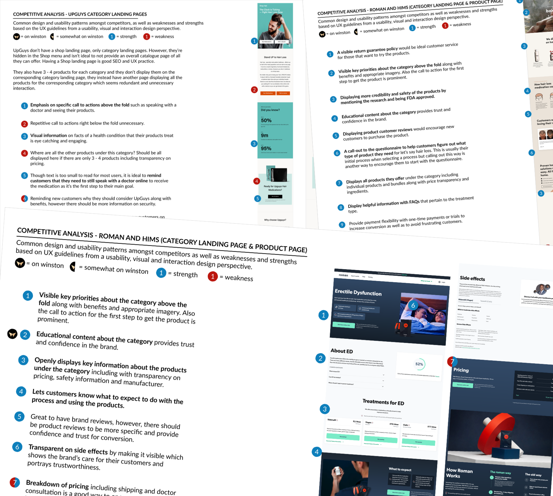
Understanding that there will be more products down the road, I decided to future-proof my solution by thinking two steps ahead on how to organize the different products into their category landing pages. I also used my competitive analysis for this to demonstrate to my client how other major competitors have their products well organized as a way to provide an exploratory and educational experience for each category. I recommended that this will also make their Winston brand more credible and trustworthy.
Before jumping right into wireframing, I mapped out the ideal user flow on paper along with a content strategy to share with the client first. I was working with the SEO specialist on what keywords we should be using based on what users are searching for. We agreed to hire a freelance copywriter during the high-fidelity wireframe stages who I managed and worked with closely which saved us a lot of time.
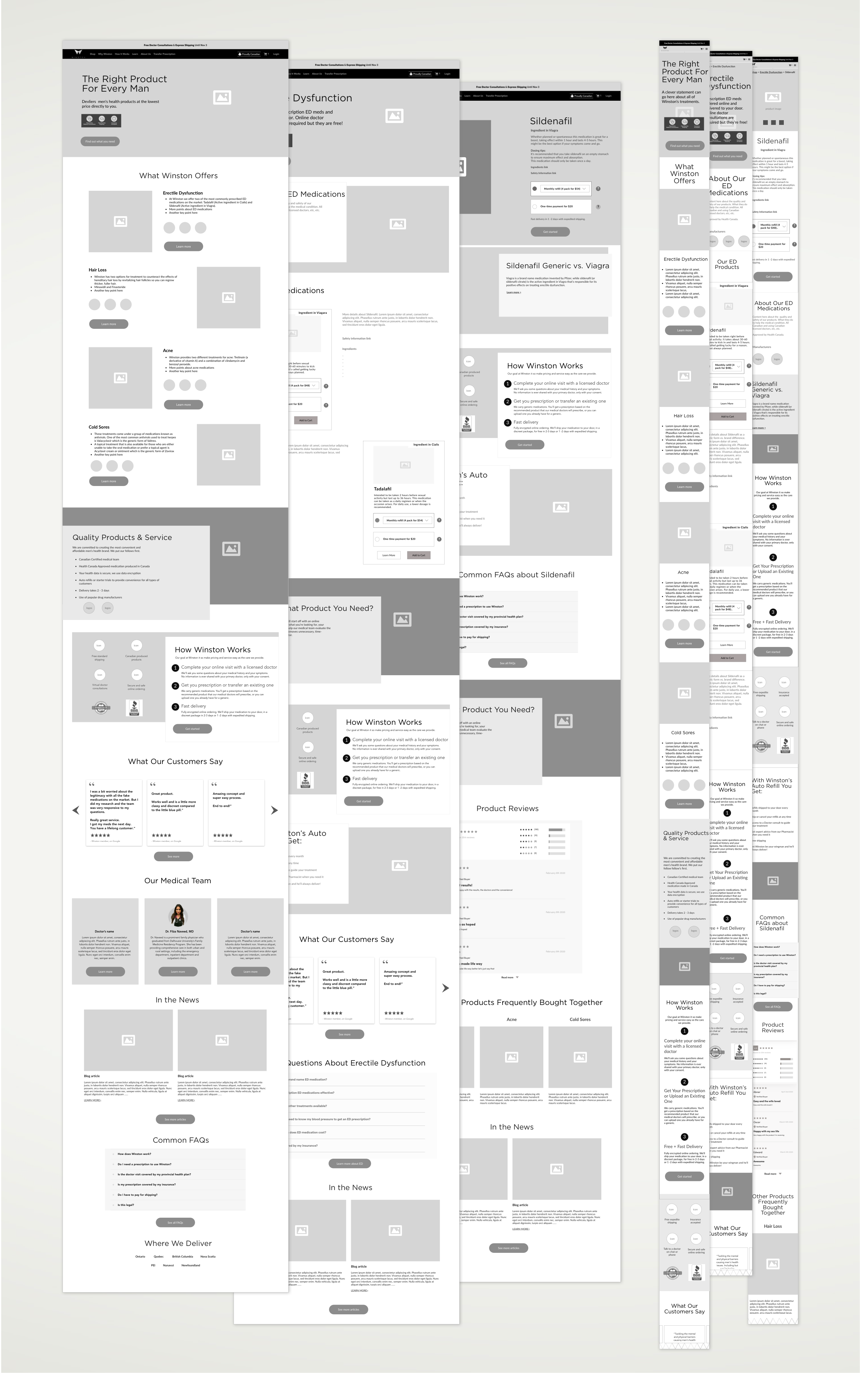
I was the main designer for this project so I lead the design mock-ups as well while I was working closely with a graphic designer, directing on what kind of stock imagery and iconography to consider based on the brand, content and UI.
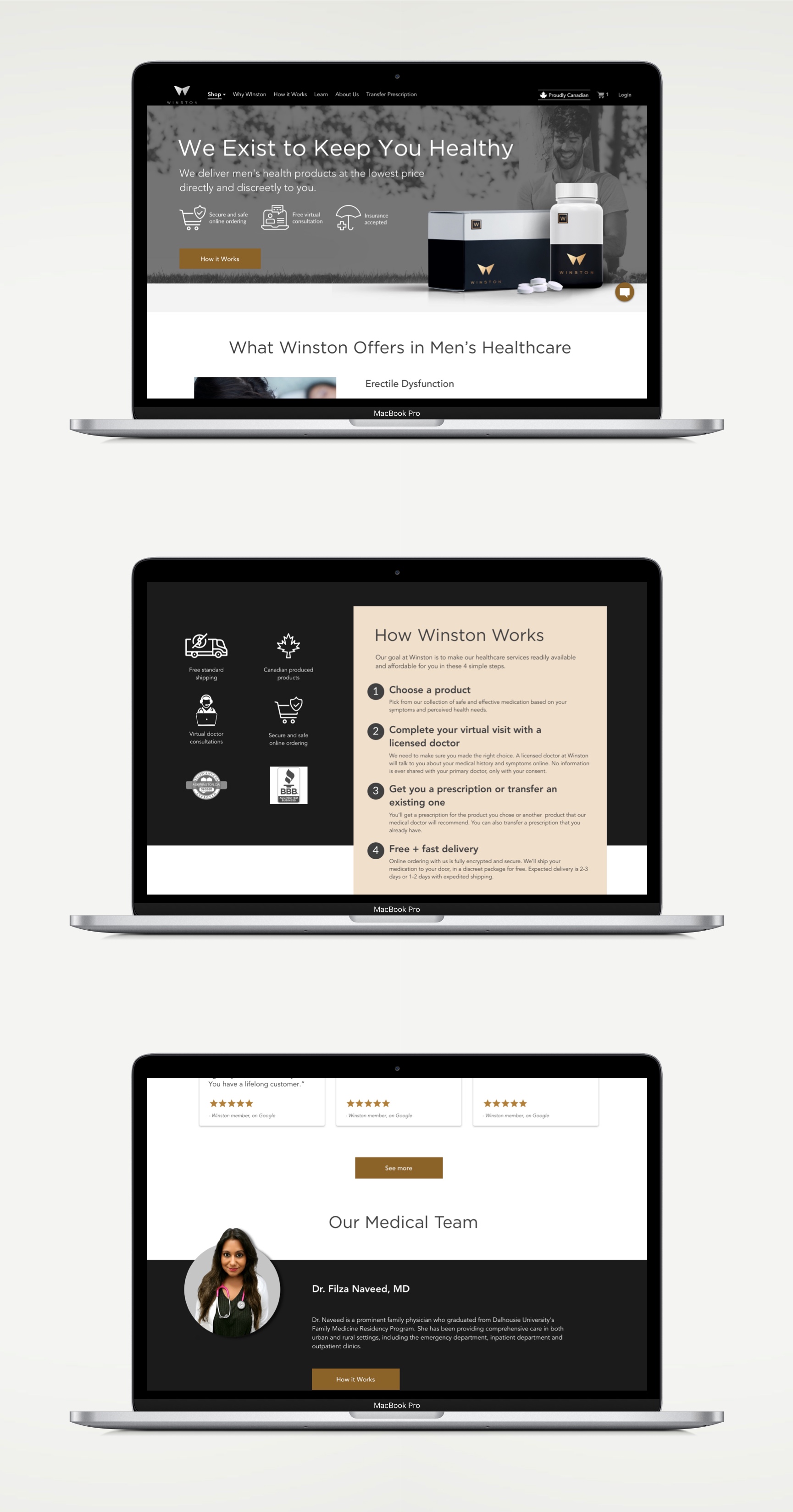
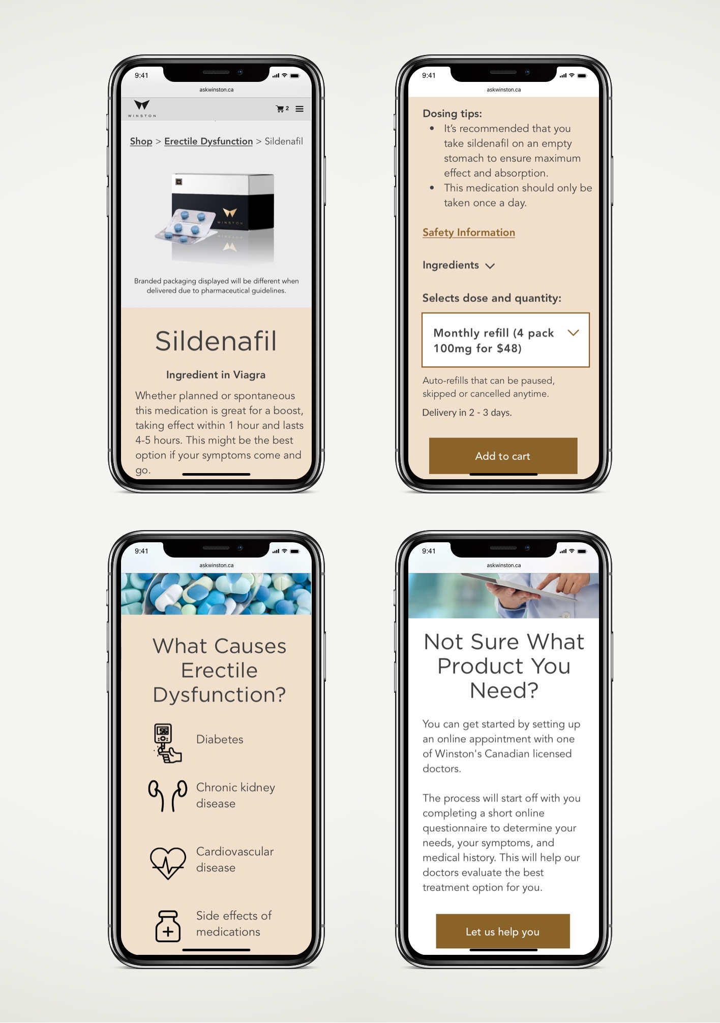
Overall, I guided redesigning key pages such as the homepage, product pages and registration/checkout flow. I also took into account their virtual care booking experience by recommending to include an initial questionnaire while booking an appointment with a doctor to receive a prescription, as well as embedding this into the customer registration as an option as well to help guide their customer journey. I also recommended improving the booking experience during checkout.
Have a questions or want to chat about possibly working together?
Feel free to contact me!