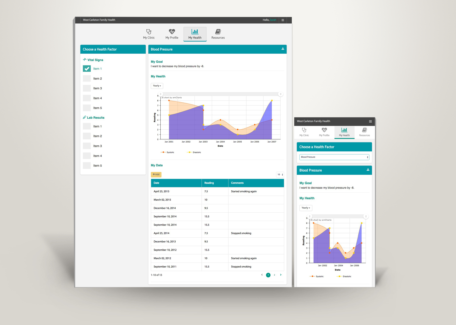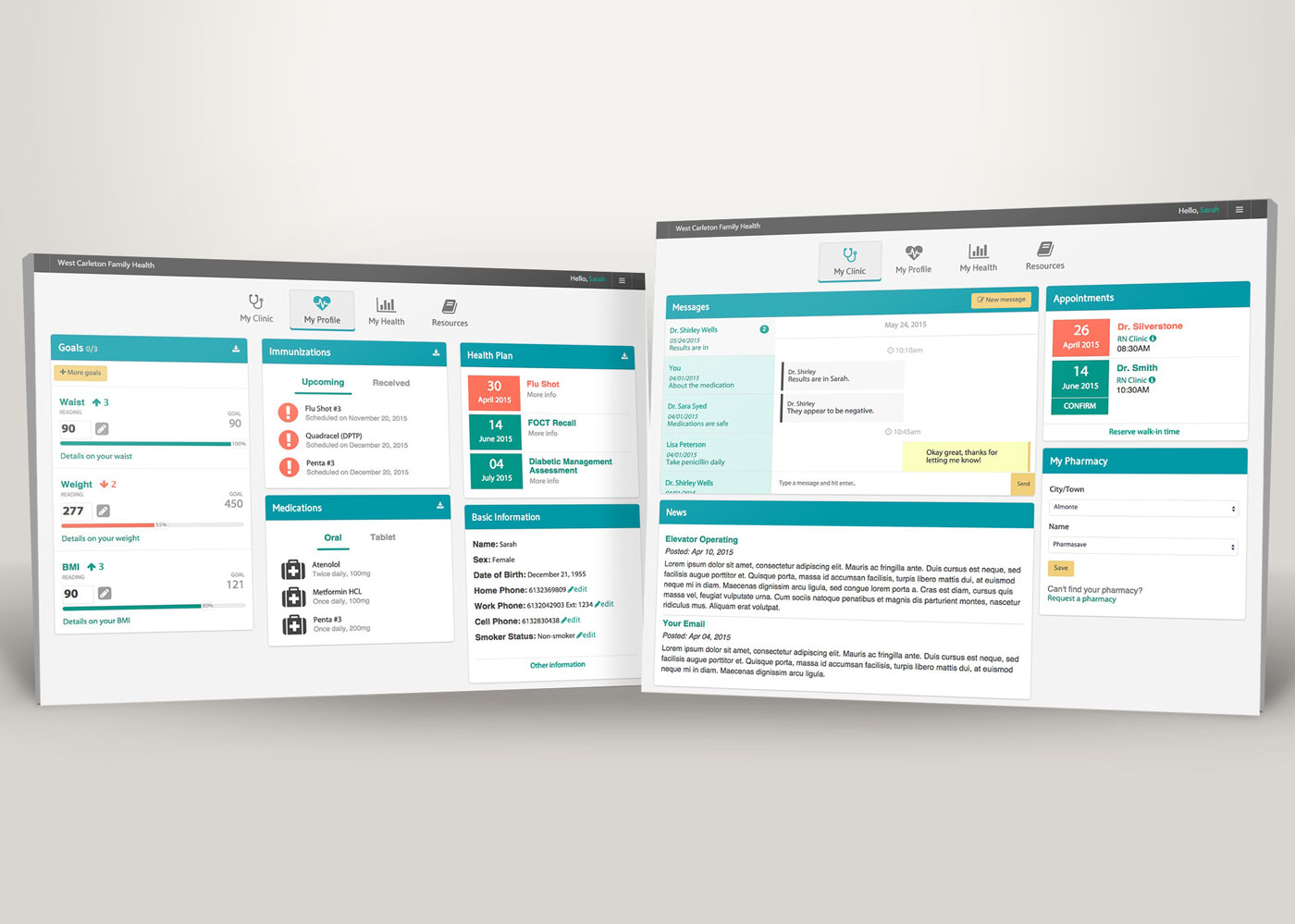
While working for my client Nova Networks, I redesigned a health portal for the patients and health professionals of West Carleton Family Health Team. The goal was to change the interface to be more user-friendly for a primary target audience of 50+.
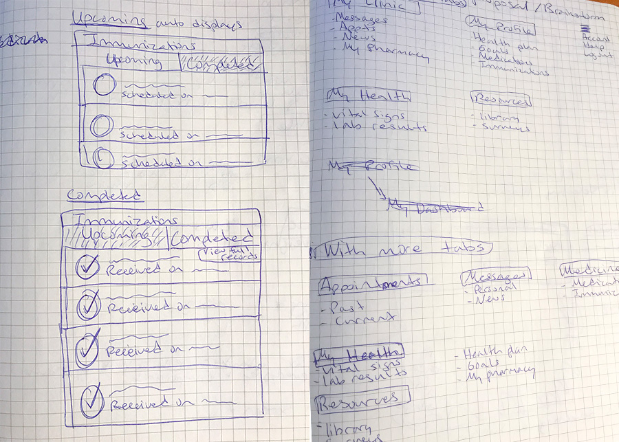
The health portal resulted in having better structure of information and is appropriately combined under fewer categories with better naming conventions. This way they would be able to use the portal with less friction as well as making it cross-compatible.
Though the research was quite limited for this project due to the timeline and minimal resources, I managed to squeeze in some time to look at existing case studies online on healthcare dashboards and design patterns and gathering any more requirements I can get from the client. Some of these requirements were common target audiences and types of data that is necessary and unnecessary due to an overload of information that can slow down the experience.Based on the case studies I read, emulating the online experience to the physical environment of a doctor's office or hospital office would help doctors and nurses recognize patterns easily, therefore understanding the information quicker.
Goal setting is another common feature in healthcare dashboards to allow users to keep track of their health issues and improve overall health, and this feature was then added to West Carleton's health portal. Another thing I considered based on the primary user base being 50+, I made sure that bold colour contrasting was integrated.


Through many iterations of the information architecture and layout, I've developed a prototyped version of the health portal before it got into further development. You can view it from the link below, but keep in mind there is some missing functionality of the back-end.
Have a questions or want to chat about possibly working together?
Feel free to contact me!